Spending Money Wisely
Written by Ernesto Santalla on May 27th, 2013 // Filed under Uncategorized
I realized years ago that every line added to a drawing will cost money. When working on a renovation, especially, it’s easy to get carried away and add more work assuming it won’t cost much. Oh what a treacherous path to follow that is, because costs can get out of hand and once an idea is “sold,” it’s hard to give up. To stay out of trouble, I remind my clients that anything that’s there and we don’t touch doesn’t add cost to the project. On the other hand, keeping things doesn’t always result in savings or a better project, so it’s a value judgement.
Condominium renovation projects are complex for many reasons. There is a committee, which reports to the Board of Directors, who represents the Condominium Association and is responsible to them. Renovations are usually overdue, budgeted years in advance and typically include a lengthy list of requirements and a multitude of opinions. The Dupont East in Washington, DC, was not exempt from these circumstances, but add to the mix the economy was at a very low point when the project was designed in 2009 and spending money wisely suggested not spending any at all.
The project involved the redesign of the Lobby and the residential corridors. The building was built in the 1970’s and the public spaces had been last renovated in the mid to late 1980’s. There was no documentation of what the original Lobby looked like from photographs, but we had the floor plans. The committee was in agreement that the Lobby was dark, the color scheme dated, and the furnishings out of place in this building.
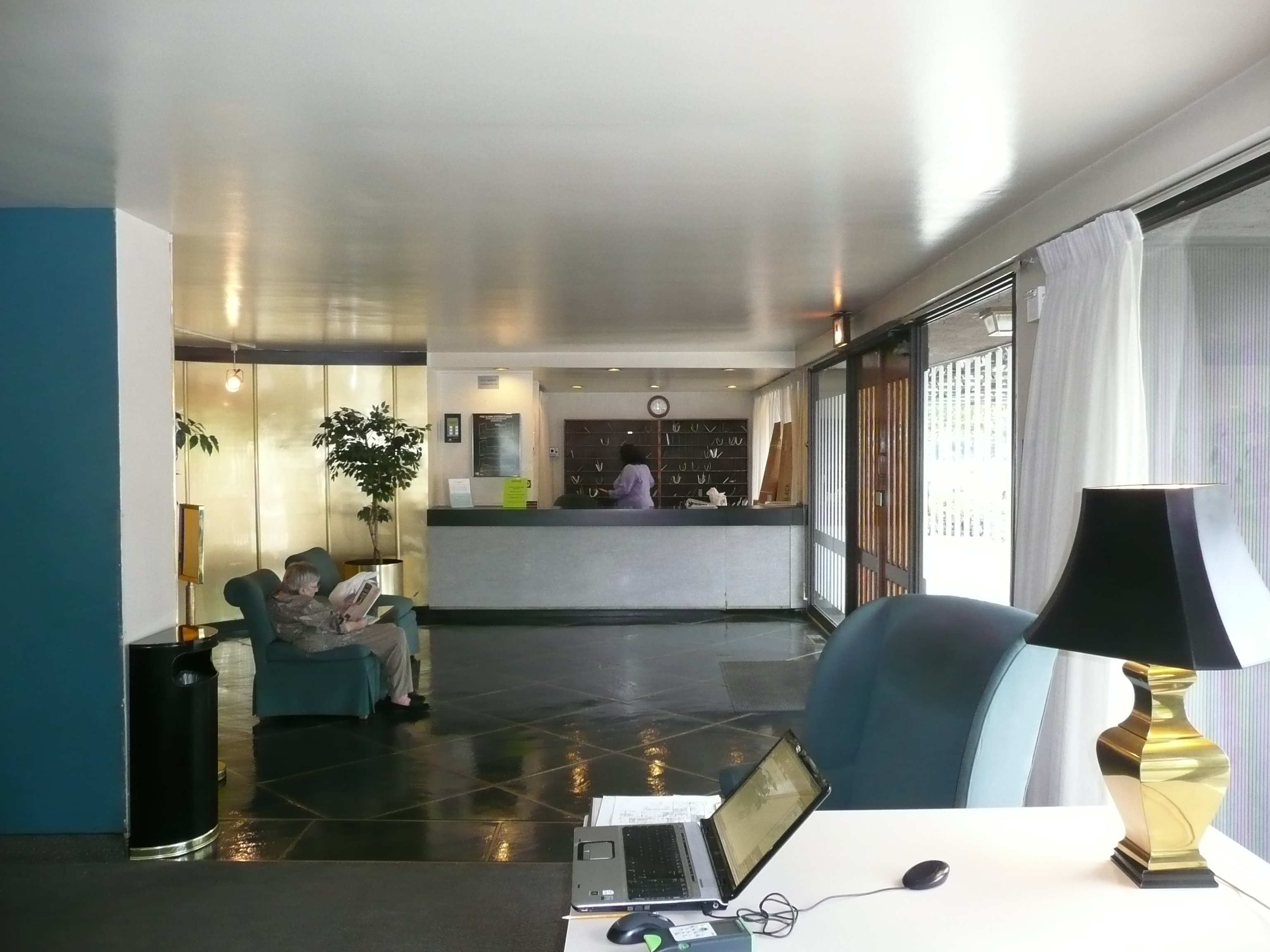
The front desk had been retrofitted many times to accommodate security, an entry system, computers, etc. The building does not have a dedicated mail room, so the mail is received and sorted by staff. The entry doors were wood and glass in an all glass enclosed space. The peek-a-boo design struck me as odd. Very dusty drapes gave the space a “homey” feeling and traditional furniture in vibrant colors gave it a “modern edge.” The gold metal wall opposite the entry doors was well, gold and shiny.
In this view from the desk, notice how dark the space is despite all the glass.
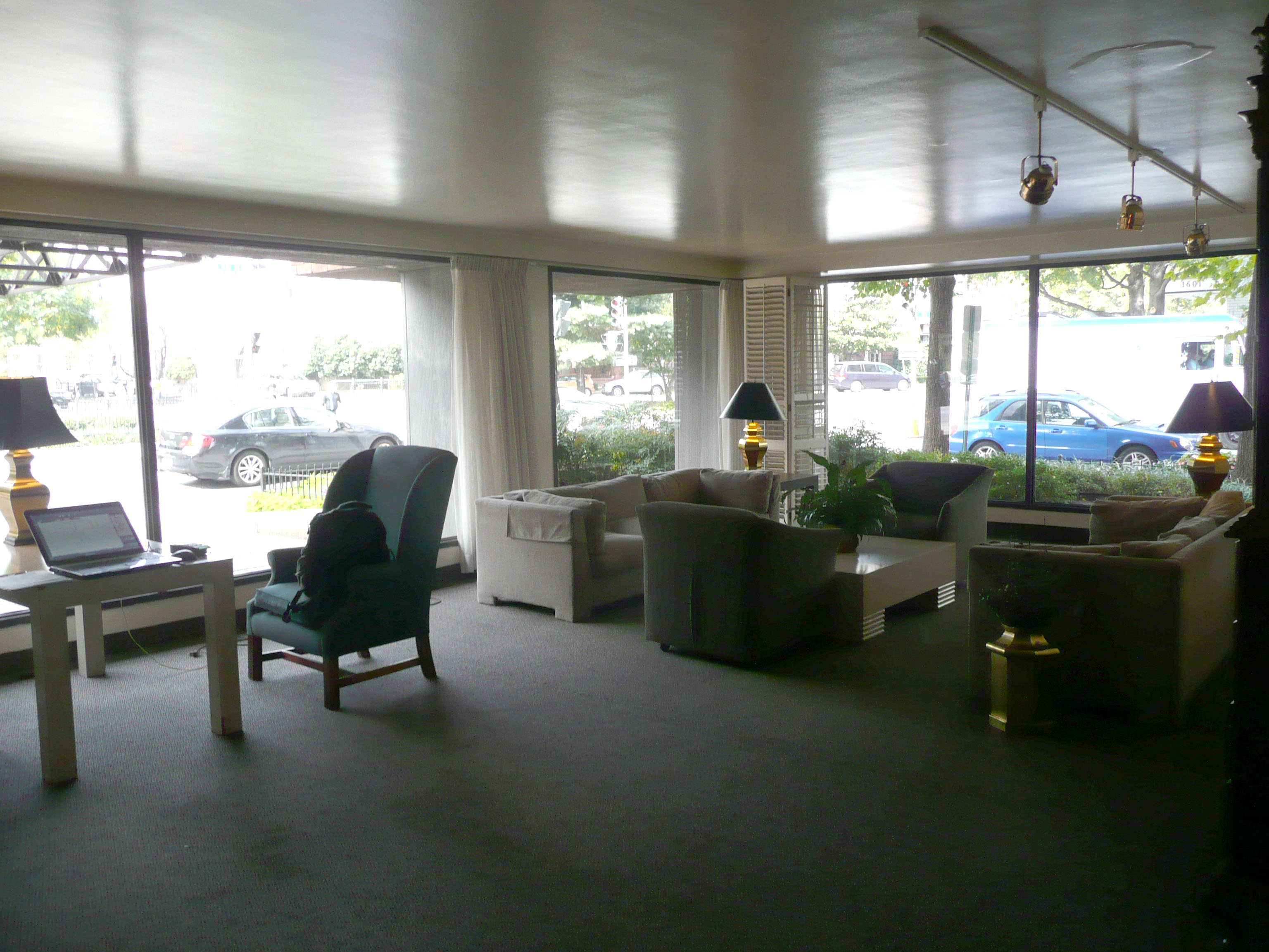
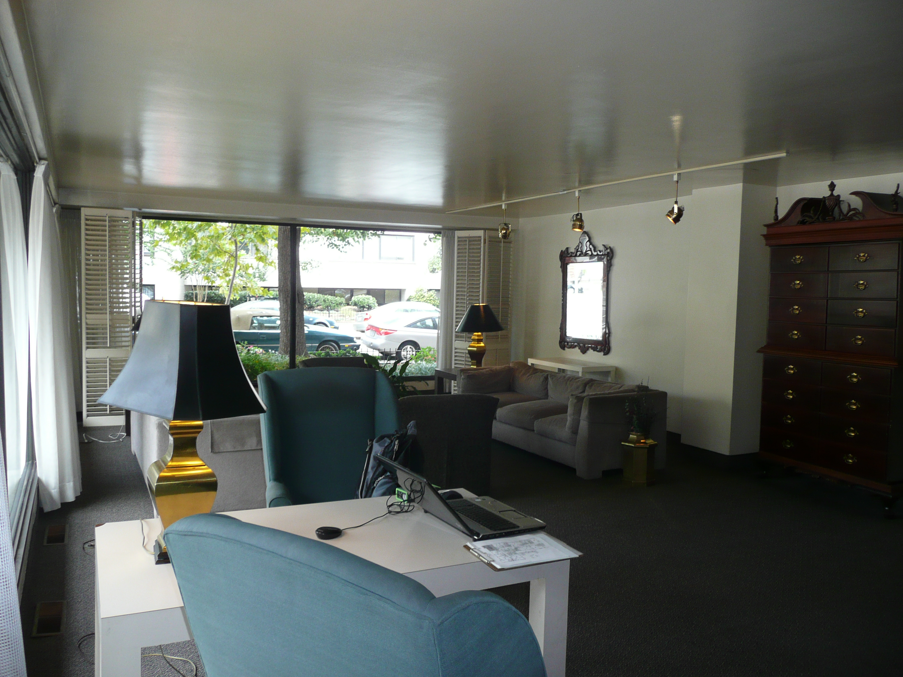
Notice how much light is coming in to the space and reflecting on the ceiling. The dark flooring is working against it. Because of the limited ceiling height, the only overhead lighting is the track lighting. The balance of the lighting in the space is from the table lamps.
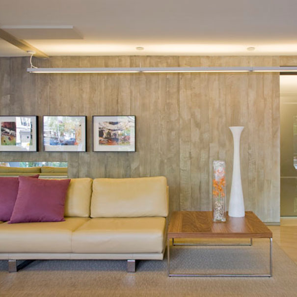
We start the process by understanding the client’s goals for the project and analyzing the strengths and weaknesses of the space. Some of the pros as illustrated in the photos are the abundance of natural light; the openness of the space to the outdoors; the landscaping surrounding the building and in the immediate area, and an ample amount of floor space available. Issues to work around are a limited ceiling height, the curved wall, which cuts up the space and creates unnecessary circulation to get to the elevators and the overall inconsistency of the design with the of the character of the building.
The Lobby, though a priority, was not considered a necessity should the corridor renovation prove more expensive than planned, so we had to get very creative if we wanted to get it all done.
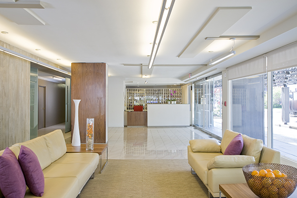
Functionally, the space stayed the same, yet it functions quite differently. The decorative pattern on the ceiling is form at the service of function as we used them to bring power to the lights hanging from the ceiling without sacrificing ceiling height. The curved wall was removed to open the space. The desk was redesigned to accommodate up to date technologies and wheelchair access.
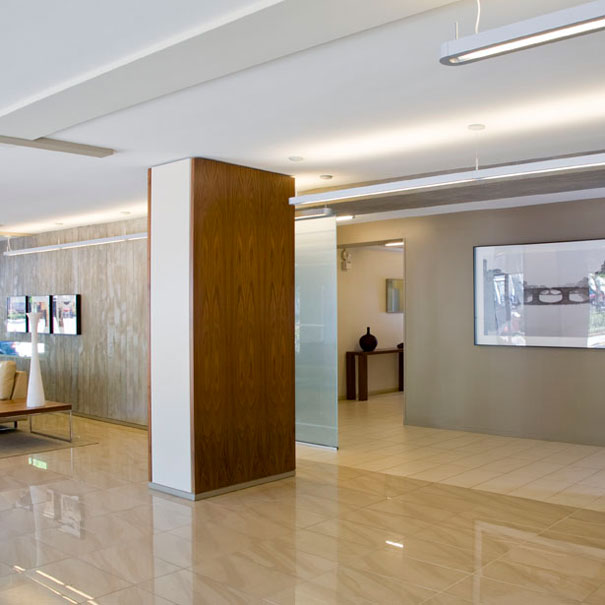
The floor finishes alternate between gloss and matte finishes. The column, free from the curved wall was faced in wood and lacquer panels. The access to the elevator lobby is clear and uninterrupted.
The back wall, which counterparts the openness of the space, incorporates a board formed concrete finish.
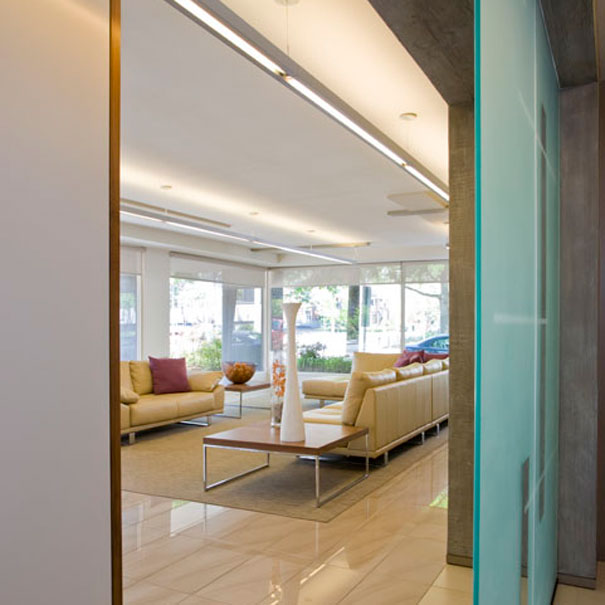
A view of the space from the elevator lobby. The old and dingy drapes are gone. For sun control, solar shades were installed.
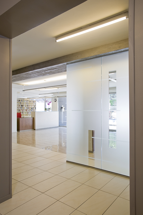
A view of the desk from the elevator lobby. The glass “screen” was frosted using the same pattern as the new, all-glass front entry doors.
We did it. We got it all within the client’s budget. Not only the construction, but the furniture and artwork as well. And most importantly, it’s quality. It was a matter of spending money wisely. Design is meant to provide a solution to a problem, or rather, a challenge, as I prefer to call it. As a consumer, I want to invest in the best quality my hard earned money can purchase. And bear in mind that everything we purchase is designed.
If you have, actively searching, thinking of, or someday want to, how will you determine which design professional to hire? Quality? Price? Or one relative to the other?